Home
»Unlabelled
» Workroom Gets a Restoration/French Makeover
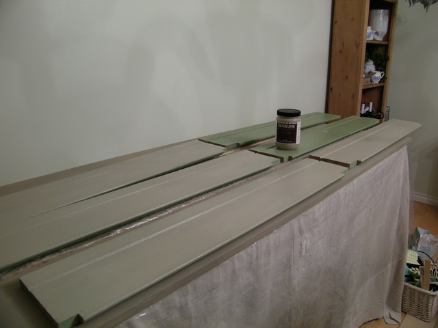
A makeover plan for my office has been in the works for the last month. While I should have been doing my christmas decorating, I was obsessing on my new idea for a room that combined the industrial look of Restoration Hardware, the Belgian color palette of earthy greys, and a touch of french cottage. The plan was going to involve lots of painting~that meant walls and almost every piece of furniture in the room.The room in its before stage. Before the mess! The disorganized overloaded mess that came after I started an etsy store and needed more storage for my items in the shop. I needed to plan for more storage and still wanted it to look uncluttered. I painted over the apple green walls with Valspar signature paint to match Benjamin Moore French Canvas. I noticed that this color reads neon green in blog photos and etsy shop images, so having a neutral color was going to eliminate that issue. French Canvas has a grey cast to it~kind of looks like fresh plaster. Here you can see what has happened with the explosion of things, and not enough places to keep it all. The scrubbed pine bookshelf was purchased last month at auction for additional storage. So while I was painting the walls I also revamped the drafting table with its sagging top by adding wide pine boards to the surface. Laid across the metal frame of the table I planned to skirt the bottom to hide the baskets of sewing notions I need for the drapery end of my business. Then, as so often happens in blog land, I got an email from a woman who created a line of paint called Caromal Colours. This paint was picked up and branded by Country Living and has been making a big splash at the Country Living Fairs as well as on the Home Shopping Network! She found my blog and wanted me to try her line of paint~ I told her I had just the project! I sent her some inspiration pictures of what I planned to do, and she selected these products for me to use.Putty and Parchment in texture basecoat was what I was going to use on my pine hutch. Since the walls were light, I would do the interior in the parchment and use the darker putty on the exterior. The line of Caromal Colours involves several steps to create a timeworn piece with great detail and depth. The pine hutch had a nice weathered finish already, but the green was going to say goodbye! I started by rolling on the parchment basecoat on the interior of the hutch. Take a close look~that paint is thicker than mayonnaise! It is not painted on as much as smooshed on with either a brush or a fluffy roller. Texture basecoat can be highlighted later by adding toner to it. Here you can see the thickness of the basecoat. Carol sent me some samples of different applications. Darker basecoats with lighter basecoats over the darker, then sanding and distressing, toning and wax. This basecoat will adhere to anything! That means glass, metal, and any surface and will not rub off. Wax is optional! It has superior bonding quality. I also used it on the boards for the drafting table and in this case added some water and did a wash of the Putty over the boards, which gave it that weathered look which was just what I was hoping for. Putty is the most fabulous color! The boards get a putty wash. A large drop cloth from Lowes was laundered and added to the table to skirt the contents beneath and the colors looked great together. Hubs scored some solid pine cubbies from a work site and they will sit on top of the long table for storage and decorative display. The room is going to have that look of wood mixed with painted pieces and lots of textures in yummy shades of grey, brown, cream and black. Back to the pine hutch~ now it is getting a coat of Putty basecoat. All the shelves in the hutch need a coat too. Do you see why I haven't posted since Tuesday? I have been busy painting!! Look how great this linen dropcloth table skirt looks!! I am getting super excited with each step. Wowsers! Ok, here is the hutch all painted, and now I have started sanding back the basecoat. I want to reveal touches of the green underneath so that is peeks through in a very understated way. Flip over the shelves and paint the second side. Then promise to lose ten pounds...but not now! I had to show you just how thick this stuff is. Do not confuse this with any other product out there. Look at the material just slowing rolling out of the container. It is kind of like joint compound. It can be thinned with water to make it more like paint, but the point is to create a sense of history and a past to your pieces by building up a layer. The thickness of the applied texture basecoat can be seen clearly here. Back to the distressing. I hate this part I will admit. Lots of people like distressing, but I don't. I love painting! I don't love sanding! But this will pay off, so I do the needful. I am using a little power sanding tool, but I did a lot of it by hand as I was not looking for a heavily distressed piece. The green peeks through the Putty.Step three: applying Toner with a rag. This part is the scary part for me. Donning latex gloves, I use a wet rag to spread and remove the toner that I applied with a brush. If you use a dry rag, it leaves more of the toner behind on the piece. Now the top of the unit is finished, and I will continue on with the rest of the piece using the Caromal Colours technique. Their website has great tutorials on how to achieve all kinds of looks, including plaster, distress, glaze, stencil and gild! You can save on shipping by entering the code MaisonD at checkout!
The finished hutch! You can see how I finished it up by visiting part II of this project here. You will also see the new curtains and draperies and some other goodies! As a special gift for all of Maison Decor readers, if you place an order with Caromal Colours you can save on shipping by entering the code MaisonD.
linking to


No comments:
Post a Comment